Ayıntap
Turkey Logistics Company
Oklahoma - Industry & Brands #Part 2
Gas & Chemical Factory
Know as ERPO, I designed this logo with a sleek, simple, minimalist design which aims to inspire confidence in the company and its services. I did experiment a lot with this one, especially with the rounded squares (as they were alot of fun to play with!). Even if we end up not using most of the designs, they can be recycled and reused later in production.

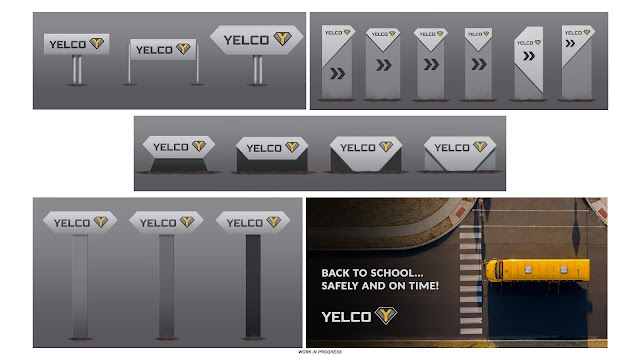
Bus Factory
This industry stood out from the rest from the very beginning. Having come with a very unique and exciting new depot, I chose to give Yelco's logo and assets a stylish, modern look - but one that also screamed "reliability". I felt like a diamond and triangular shapes in general fit the theme!
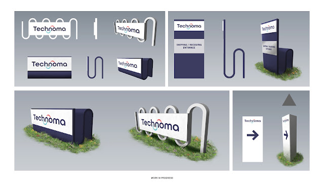
Electrical Appliance Company
Technoma's logo was a fun one to design. Since the company specializes in air conditioning, heating and cooling systems (among other things), I let these concepts inspire the logo creation. As for the assets themselves, I aimed to create a really distinct look that set the company apart from its competitors in ATS, using the "pipe" shape from the logo itself. It was a very fun assignment and I hope our players like the results.
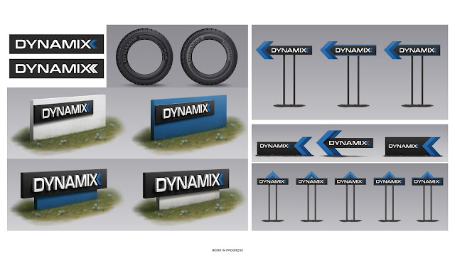
Tire Factory
Dynamix is a manufacturer that isn't at all new to ATS, you may have encountered it in your garage before where it has served as one of our default tire manufacturers for years. It's always exciting to bring an old company closer to fans and letting them interact with it. Dynamix's logo has been given a little "facelift", alongside a brand new depot and modern signs to go with it!
Public Works
Creating a logo for CCW (Central Civil Works) was a fairly challenging task, as we struggled with the artistic direction at first. Ultimately, we chose the more modern take on the logo, in a vibrant dark green colour we considered underrepresented in our game, helping the company stand out.

Furniture Store
Creating the look of our new furniture store, Myroo, was a very fun task. Unlike with most depots, Myroo gave us the opportunity to get extra creative with the building itself. I had fun experimenting with different materials, eventually settling on wooden decorative elements, which we'd use later in the signs designs as well. When it came to the design process behind the logo, the key words in this case were family-friendly, cozy & welcoming.

Comments
Social
Information


Tag: ETS2 ATS Türkiye
Language: Turkish
Created: 28 Jul 2019 19:07 UTC
Supported Games
DLCs Required: 0
Minimum Account Age: No restriction
Owner: Ayıntap Log I Mehmet/24
Members: 1
Recruitment: Open
Latest News
- Supporters Convoy - Sunday 28th June 2026 14 Jun 6:24 UTC
- Bye-bye CD Road 07 May 8:30 UTC
- TruckersMP 12 Year Anniversary 24 Apr 17:56 UTC
Useful Links
Support TruckersMP
2026 © All Rights Reserved. Privacy Policy | Terms of Service | Rules | Code of Conduct | Platform Status | RSS | Consent Manager